

Four Types of Bar Charts in Python - Based on Tabular Data
By @Jin5 min read
Simple Bar Charts in Python Based on Tabular Data
import matplotlib.pyplot as plt
import pandas as pd

df = pd.DataFrame({'x': ['A', 'B', 'C', 'D', 'E'],
                   'y': [50, 30, 70, 80, 60]})

plt.bar(df['x'], df['y'], align='center', width=0.5, color='b', label='data')
plt.xlabel('X axis')
plt.ylabel('Y axis')
plt.title('Bar chart')
plt.legend()
plt.show()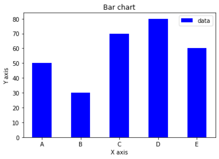
Stacked bar chart in Python Based on Tabular Data
import matplotlib.pyplot as plt
import pandas as pd

df = pd.DataFrame({'x': ['A', 'B', 'C', 'D', 'E'],
                   'y1': [50, 30, 70, 80, 60],
                   'y2': [20, 40, 10, 50, 30]})

plt.bar(df['x'], df['y1'], align='center', width=0.5, color='b', label='Series 1')
plt.bar(df['x'], df['y2'], bottom=df['y1'], align='center', width=0.5, color='g', label='Series 2')
plt.xlabel('X axis')
plt.ylabel('Y axis')
plt.title('Stacked Bar Chart')
plt.legend()
plt.show()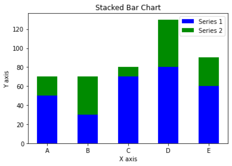
Grouped bar chart based on Tabular Data in Python
import matplotlib.pyplot as plt
import pandas as pd
import numpy as np

# Prepare the data
df = pd.DataFrame({
    'group': ['G1', 'G2', 'G3', 'G4', 'G5'],
    'men_means': [20, 35, 30, 35, 27],
    'women_means': [25, 32, 34, 20, 25]
})
ind = np.arange(len(df))  # x-axis position
width = 0.35  # width of each bar

# Plot the bar chart
fig, ax = plt.subplots()
rects1 = ax.bar(ind, df['men_means'], width, color='r')
rects2 = ax.bar(ind + width, df['women_means'], width, color='y')

# Add labels, legend, and axis labels
ax.set_xticks(ind + width / 2)
ax.set_xticklabels(df['group'])
ax.legend((rects1[0], rects2[0]), ('Men', 'Women'))
ax.set_xlabel('Groups')
ax.set_ylabel('Scores')

# Display the plot
plt.show()
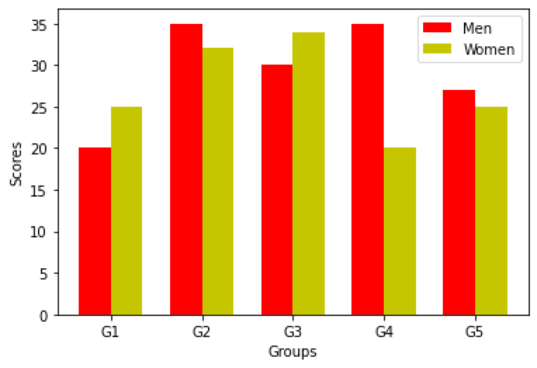
Percent stacked bar chart based on Tabular Data in Python
import matplotlib.pyplot as plt
import pandas as pd

# Prepare the data
df = pd.DataFrame({
    'x': ['Group 1', 'Group 2', 'Group 3', 'Group 4', 'Group 5'],
    'y1': [10, 20, 30, 25, 30],
    'y2': [20, 25, 30, 15, 20],
    'y3': [30, 30, 25, 20, 10]
})

# calculate percentage
y_percent = df.iloc[:, 1:].div(df.iloc[:, 1:].sum(axis=1), axis=0) * 100

# plot the chart
fig, ax = plt.subplots()
ax.bar(df['x'], y_percent.iloc[:, 0], label='Series 1', color='r')
ax.bar(df['x'], y_percent.iloc[:, 1], bottom=y_percent.iloc[:, 0], label='Series 2', color='g')
ax.bar(df['x'], y_percent.iloc[:, 2], bottom=y_percent.iloc[:, :2].sum(axis=1), label='Series 3', color='b')

# Display the plot
plt.show()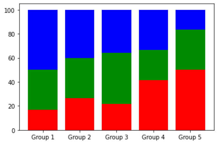
Related Articles
- How to read and write JSON files in Python
- Python: Effective Techniques for Managing Dates in DataFrame
- Four Types of Bar Charts in Python - Based on Array Data
- How to Use the Concat Function in Pandas for Horizontal or Vertical Table Concatenation
- How to Convert Rows to Columns and Columns to Rows in Pandas DataFrame using Python?
The newsletter
Data in the Age of AI
Exploring how AI is reshaping business intelligence, data architecture, and the way organizations work with data. Get new essays from @Jin delivered to your inbox.
Visit the publication on Substack →Add Comments
Comments
Loading comments...